

01. The Problem
A creator with no home base.
Altback had been creating digital art resources — brushes, textures, tutorials — for years, scattered across DeviantArt, Gumroad, and YouTube. But there was no brand. No single place a user could land and understand who Altback was, what they made, or find what they needed.

Pain points with the earlier existing webpage:


02. Research and Discovery
Understanding the creator and their community.
I began with a stakeholder discovery session to clearly define what Altback needed and why. I then supplemented this with secondary research — combing through DeviantArt comment sections, YouTube analytics patterns, and creator community forums to understand the audience's actual behavior.


Key questions we explored
- How do digital artists currently find and download resources?
- What causes users to bounce from resource sites without downloading?
- What does a trustworthy, professional creator look like to a newcomer?
- How do video tutorials and downloadable resources complement each other?
- What would make someone return to Altback — and tell others about it?
What we assumed going in
- Artists prefer to browse resources by software (Photoshop, Krita, CSP)
- Video tutorials would be the primary draw for new visitors
- Free resources would get dramatically more traffic than paid ones
- A blog would be nice-to-have, not a primary user need
- Users would want to create accounts to save favourite resources
03. Key Insights
What the research revealed.
Several patterns emerged consistently across the community research and stakeholder sessions.


04. User Persona
Designing for the digital enthusiast.
From our research patterns, a clear primary user emerged — someone actively growing their digital art skills who moves fluidly between platforms in search of tools.

05. User Journey
From scattered to seamless.
Mapping Aryan's journey revealed exactly where the old experience broke down — and where the new site needed to step up.

06. Card Sorting
How do digital artists naturally group and name the content on Altback.com?
Why Card Sorting: Altback was being structured from scratch. Rather than imposing a format-based architecture (Products / Videos / Blog), I wanted to first understand how target users think about this content — what belongs together in their minds.
Study Type: Open card sort — participants were given no predefined categories, so groupings and labels came entirely from them.
Format: Remote, moderated. Each session ran 30–40 minutes over video call. Participants were asked to think out loud while sorting.
Three participants matching the primary persona profile — digital art enthusiasts, aged 21–26.
24 cards covering every content type. Cards were presented in randomized order with no visual grouping.

Participants group and label the cards.
Participants scan the set of cards and organize them into groups that make sense to them. After this, they label them. Below are the representation of groups and labels created by each participant.


Three different participants, independently, produced four recognizable categories — Download Resources, Watch & Learn, Read/Blog, Connect. That's backbone for our IA. Two of them also thought in software-first terms, which is why we needed filters on product page.
07. Information Architecture
Mapping the paths through the site.
Card sorting shaped the site's information architecture and navigation structure.

08. User Flow and User Stories
What are user goals and how would they achieve them?
After conducting user research, it was a good time to create user stories to highlight the main objectives and goals that users might have. These user stories were then translated into user flows, illustrating how users would navigate the website to accomplish their goals.


09. Wireflows
2D Lo-Fi Wireflows
Based on user flows, sketch wireflows were created to explore the basic layout and interactions between pages.


Digital Lo-Fi Wireflows
Sketch wireflows were then refined into digital lo-fi wireflows to define the layout, content structure, and interaction patterns.


10. Brand Identity and Visual Design
The brand identity established the visual language that would inform all high-fidelity UI decisions.
Building the mark from the name up.
The name Altback comes from the keyboard shortcut Alt+Backspace — a nod to iterating, undoing, and starting fresh. The identity had to carry that spirit: creative, a little unconventional, professional enough to be taken seriously.
The Logo System
All configurations maintain consistent proportions and legibility across contexts.
Colour System
A restrained, purposeful palette built around contrast and recognition.

Typography
Bebas Neue – Condensed geometric sans-serif. Industrial clarity with a digital native feel. Used for the wordmark, large chapter numbers, and UI labels throughout the site.
DM Sans – Clean, legible, and contemporary. DM Sans handles long-form reading without fatigue, critical for blog articles and resource descriptions.
11. Brand Merchandise
When identity goes physical.
A new brand needs touchpoints beyond the screen.. We designed two T-shirt variations for Altback — one minimal, one expressive — to be used as promotional merch and giveaways. They were actually printed. One ended up with me.

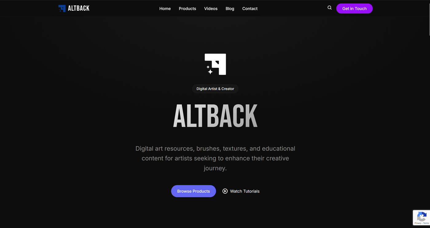
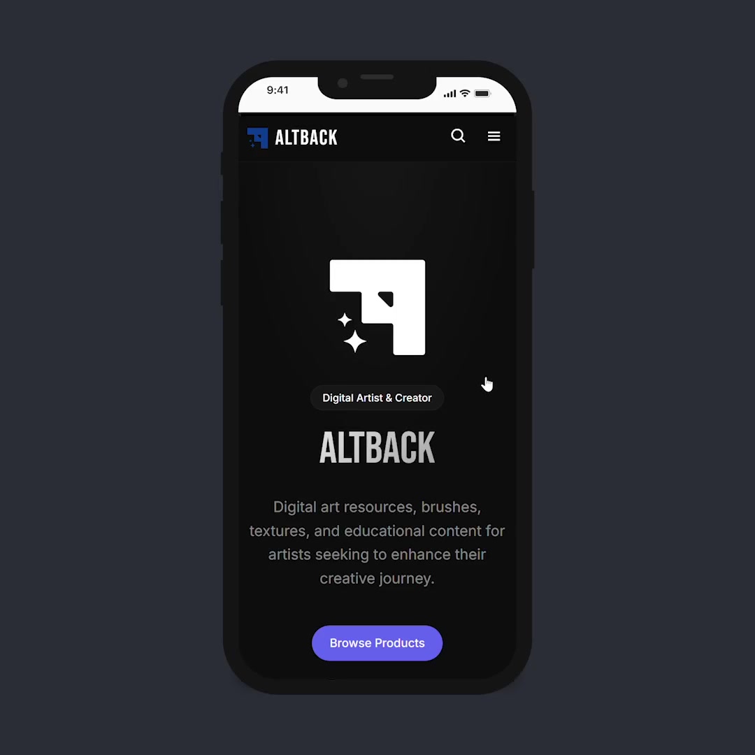
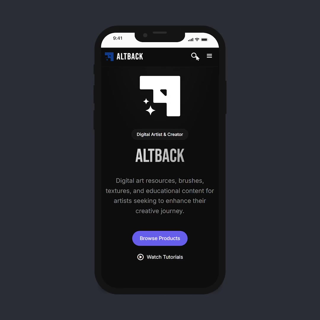
12. Key Screens
I am adding few of the key screens from the projects to show the high fidelity UI design and the flow for the first user story where they have to browse and download a resource.
Homepage


13. Development
Building a CMS that scales with the creator.
The old static Jekyll site was a dead end for growth. The new platform needed to support a product catalogue, video embeds, long-form blogging, newsletter management, and future extensibility — all manageable by a single non-technical creator.
Tech stack used for this project:
- Wagtail CMS+Django
- HTML/CSS/JS
- Google reCaptcha
- Google Analytics
14. Outcomes & Metrics
Lighthouse scores, analytics from the first 28 days, and real-world performance paint a clear picture. The foundation is solid — and it's just getting started.

2 minutes 41 seconds average engagement. For a niche digital art resource site that launched weeks ago — that's artists actually reading, browsing, and exploring. Not bouncing.
Future Improvements.
The project is actively evolving. Things that are identified for future improvements:
- No user accounts or saved favorites — returning users can't bookmark products or track which brushes they've downloaded.
- Users still have to rely on the external download platforms, which may be a downside for active user engagement.
- No user reviews or ratings — social proof is missing entirely.
- Newsletter subscription has no preference selection — users can't choose to receive updates only about specific topics (brushes, tutorials, blog posts).
- No double opt-in confirmation email flow documented in the UX artifacts, though it has been implemented in production.
Link to live site: https://altback.com


